David Bowie Album Artwork: A Visual Journey Through Albums
David Bowie Album Artwork musical genius extended far beyond sound his album covers became iconic pieces of visual art

David Bowie Album Artwork musical genius extended far beyond sound his album covers became iconic pieces of visual art that defined entire decades. From the lightning bolt of Aladdin Sane to the mysterious black star of his final release, Bowie’s album artwork tells a story of artistic evolution, cultural commentary, and visual innovation that continues to influence designers and musicians today.
Each David Bowie album cover represents a carefully crafted visual statement, often as groundbreaking as the music contained within. The artwork served as a window into Bowie’s ever-changing personas, from Ziggy Stardust’s glam rock theatricality to the Thin White Duke’s stark minimalism. These covers didn’t just package music they created cultural moments that transcended the record industry.
The collaboration between Bowie and visionary artists, photographers, and designers resulted in some of the most recognizable album covers in music history. Understanding the stories behind these images reveals how visual art and music can combine to create something greater than the sum of their parts.
David Bowie Album Artwork: A Timeline of Visual Evolution
The Early Years (1967-1970)
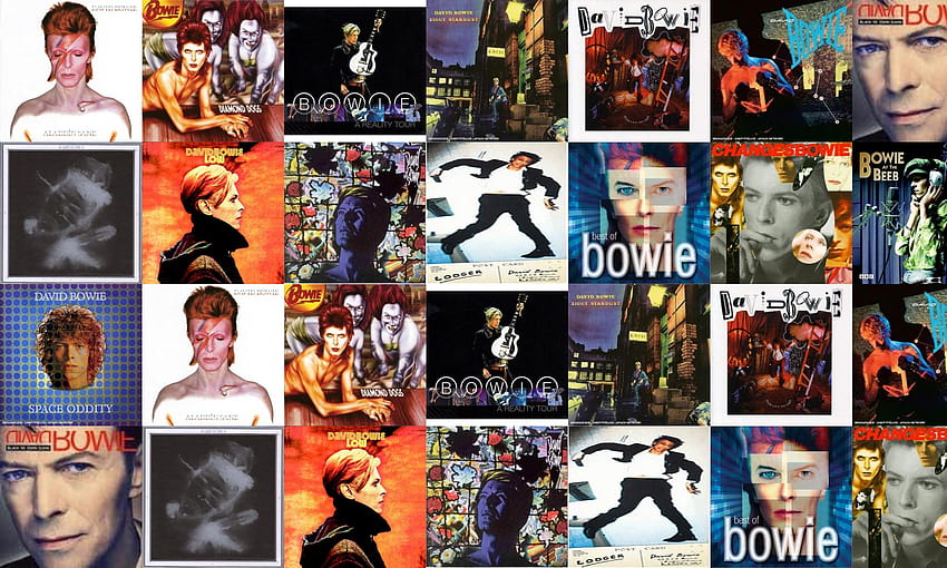
David Bowie (1967) marked the beginning of Bowie’s recording career with artwork that reflected the psychedelic trends of the late 1960s. The cover shows a young, uncertain Bowie, far from the confident personas he would later embody. This debut album artwork, while not among his most celebrated, established the pattern of using his own image as the primary visual element.
Space Oddity (1969) introduced space-age themes that would become central to Bowie’s mythology. The cover features neat effects around Bowie’s head that complement the album’s cosmic themes, though the execution feels somewhat dated by modern standards.
The Man Who Sold the World (1970) showcased Bowie’s first major experiment with gender-bending imagery. The original UK release featured Bowie in a dress, reclining on a chaise lounge a bold statement that challenged conventional masculinity and set the stage for his future theatrical personas.
The Glam Rock Era (1971-1974)
The 1970s represented the peak of David Bowie album artwork innovation. Hunky Dory (1971), designed by Terry Pastor and George Underwood, drew inspiration from photographs of Marlene Dietrich. The cover’s androgynous beauty and sophisticated composition reflected Bowie’s growing confidence as both a musician and visual artist.
The Rise and Fall of Ziggy Stardust and the Spiders from Mars (1972) created one of the most iconic album covers in rock history. The artwork perfectly captured the theatrical essence of the Ziggy Stardust persona, combining otherworldly glamour with street-level grit. This David Bowie album art became synonymous with glam rock itself.
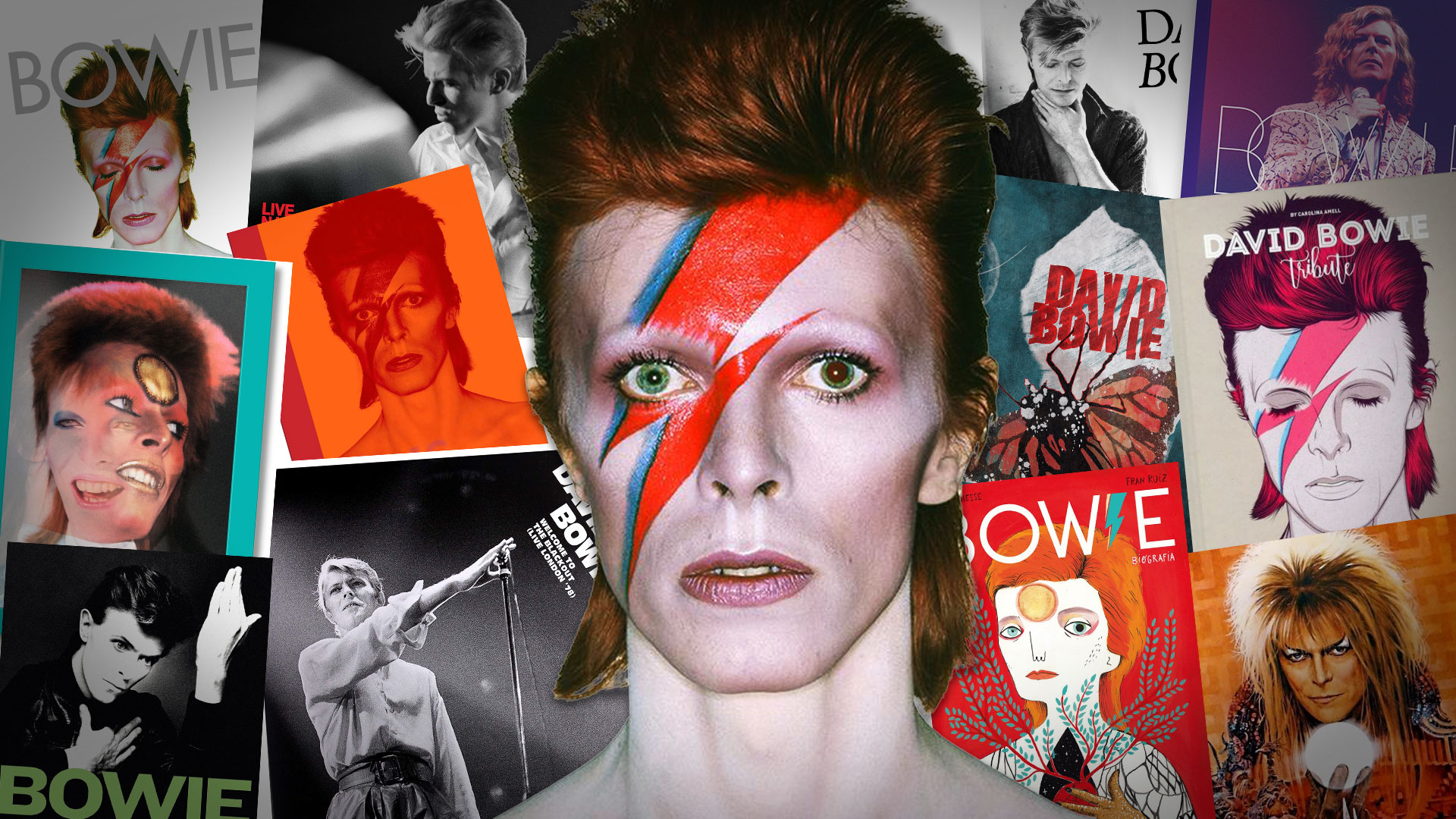
Aladdin Sane (1973) featured the legendary lightning bolt image created by photographer Brian Duffy and makeup artist Pierre La Roche. The lightning flash was inspired by the ignition symbol on Duffy’s cooker, proving that great art can emerge from the most mundane inspirations. This cover marked the death of Ziggy Stardust and the birth of another iconic Bowie persona.
Diamond Dogs (1974) presented Guy Peellaert’s painted masterpiece featuring Bowie as Halloween Jack. The detailed hand-drawn cover showcased a fantastic color spectrum and deep focus on world-building, creating a visual narrative that complemented the album’s dystopian themes.
The Soul and Electronic Phases (1975-1979)
Young Americans (1975) shifted toward a cooler, more chic aesthetic that reflected Bowie’s exploration of soul music. The profile shot captured a more mature artist, complete with ginger hair and a lit cigarette that conveyed both sophistication and rebellion.
Station to Station (1976) utilized a striking black and white photograph from “The Man Who Fell to Earth” film set. Bowie insisted on the cropped version, creating a mysterious and intriguing image that perfectly matched the album’s themes of identity and transformation.
The late 1970s brought us the Berlin trilogy covers, starting with Low (1977). This cover, also taken from “The Man Who Fell to Earth” stills, used orange and black color contrast to create one of Bowie’s most visually striking album covers. The minimalist approach reflected the experimental nature of the music within.
“Heroes” (1977) became iconic for its standard black and white profile shot, featuring Bowie in a pose that seemed perfectly suited to the harsh sounds and Berlin-esque soundscapes of the album.
Lodger (1979) played with visual storytelling by showing only half of Bowie on the front cover, with the other half appearing on the back complete with a broken nose creating an intriguing visual puzzle that reflected the album’s fragmented nature.
David Bowie Album Artwork in the 1980s
The 1980s saw David Bowie album art embrace the decade’s bold aesthetic choices. Scary Monsters (And Super Creeps) (1980) featured clever artwork that began as a Brian Duffy photograph and was then painted by Edward Bell. The cover showed a cool sketch of Bowie with his peculiar shadow pasted over the real-life image, creating a layered visual effect that matched the album’s complex themes.
Let’s Dance (1983) married a distinctly 1980s wordmark with a photograph of a macho-boxing Bowie. The flashy cover art made vibrant use of orange, showing boxer Bowie towering over a city landscape a perfect visual representation of the album’s commercial ambitions and dance-floor energy.
Tonight (1984) created a bold saturated image in the style of Gilbert and George’s Faith Curse, while Never Let Me Down (1987) featured a decently colorful and fun circus-themed aesthetic, though critics noted the questionable outfit and hair choices.
Later Career and Legacy Covers (1990s-2010s)
The 1990s brought experimental approaches to David Bowie album covers. Earthling (1997) showcased 1990s style with Bowie sporting a multi-colored coat designed by Alexander McQueen, set against what critics described as a “Windows Vista background.”
Hours… (1999) featured two different Bowies interacting, creating symbolic imagery that reflected themes of duality and self-reflection. Heathen (2002) presented an ominous design with freaky eyes and an upside-down title, created by Jonathan Barnbrook with a heretic, anti-religious feel.
Reality (2003) continued Barnbrook’s collaboration with Bowie, featuring a cartoonish and unreal-looking design that critics found less successful than their other partnerships.
David Bowie Album Art
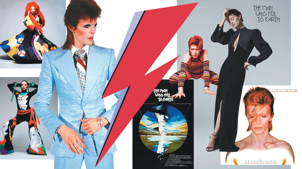
David Bowie’s album artwork evolved dramatically throughout his career, beginning with his 1967 self-titled debut and culminating with 2016’s haunting Blackstar. Each cover reflected not only his musical transformation but also the changing landscape of graphic design and photography.
The early albums showcased a more traditional approach to album design, but as Bowie developed his theatrical personas, his album covers became increasingly bold and conceptual. This visual evolution paralleled his musical journey, with each David Bowie album artwork serving as a window into his creative mindset during different periods.
David Bowie Studio Albums in Order
| Year | Album Name |
|---|---|
| 1967 | David Bowie |
| 1969 | Space Oddity |
| 1970 | The Man Who Sold the World |
| 1971 | Hunky Dory |
| 1972 | The Rise and Fall of Ziggy Stardust and the Spiders from Mars |
| 1973 | Aladdin Sane |
| 1973 | Pin Ups |
| 1974 | Diamond Dogs |
| 1975 | Young Americans |
| 1976 | Station to Station |
| 1977 | Low |
| 1977 | “Heroes” |
| 1979 | Lodger |
| 1980 | Scary Monsters (and Super Creeps) |
| 1983 | Let’s Dance |
| 1984 | Tonight |
| 1987 | Never Let Me Down |
| 1993 | Black Tie White Noise |
| 1995 | Outside |
| 1997 | Earthling |
| 1999 | ‘Hours…’ |
| 2002 | Heathen |
| 2003 | Reality |
| 2013 | The Next Day |
| 2016 | Blackstar |
10 Favorite David Bowie Album Covers

1. Aladdin Sane (1973)
The Aladdin Sane cover remains perhaps the most iconic image in rock history. Photographer Brian Duffy captured this legendary shot, working with makeup artist Pierre La Roche to create the striking lightning bolt design. Duffy later revealed that the lightning flash inspiration came from seeing the ignition symbol on his cooker a moment of creative brilliance that would define Bowie’s image forever.
The red and blue lightning bolt against Bowie’s pale skin and vibrant red hair created an image that transcended music iconography to become a pop culture legend. This David Bowie album artwork perfectly captured the theatrical excess of the Ziggy Stardust era.
2. The Rise and Fall of Ziggy Stardust and the Spiders from Mars (1972)
This cover established the visual language for one of Bowie’s most famous personas. The artwork helped cement the Ziggy Stardust character in popular consciousness, creating an image that remains instantly recognizable decades later. The cover’s theatrical quality matched the album’s conceptual nature, making it a perfect marriage of visual and musical art.
3. Diamond Dogs (1974)
Created by Belgian artist Guy Peellaert, this painted masterpiece features Bowie as his Halloween Jack character. The original artwork included more explicit canine features, but these were toned down for the final release. The cover showcases incredible detail and a fantastic color spectrum that feels worthy of gallery exhibition. The David Bowie album artwork here demonstrates his commitment to high-concept visual storytelling.
4. Scary Monsters (And Super Creeps) (1980)
This clever cover began as a Brian Duffy photograph, which was then painted over by Edward Bell. The concept shows a lifeless drawing pasted over the real Bowie, leaving only a dark shadow—a brilliant metaphor for the album’s themes. The Pierrot-style clown costume also appeared in the “Ashes to Ashes” music video, creating visual continuity across different media.
5. “Heroes” (1977)
The stark, monochromatic cover of “Heroes” perfectly captures the Berlin-era atmosphere. Bowie’s iconic pose against the minimal background reflects the harsh sounds and industrial landscapes that influenced this period of his work. The lack of color enhances the emotional intensity of both the music and visual presentation.
6. Let’s Dance (1983)
This cover marries classic ’80s design aesthetics with a photograph of boxing-gloved Bowie. The vibrant orange color palette and the image of Bowie towering over a cityscape create a memorable visual that perfectly represents his commercial breakthrough period.
7. Low (1977)
Another image taken from “The Man Who Fell to Earth” film set, this cover uses striking color contrast between orange and black. The cropped, atmospheric quality of the image reflects the experimental nature of the music contained within.
8. Lodger (1979)
The mysterious quality of this cover, showing only a partial view of Bowie, creates intrigue and maintains his enigmatic persona. The composition draws viewers in while keeping the subject tantalizingly out of complete view.
9. 1.Outside (1995)
This emotionally charged cover features an expressionistic painting style that perfectly matches the album’s experimental nature. The aggressive brushwork and emotionless figure create a visual representation of the music’s intensity.
10. Earthling (1997)
A explosion of color featuring Bowie in a multi-colored coat designed by Alexander McQueen. The vibrant palette and Bowie’s pose facing away from the camera add mystery while showcasing his continued evolution as both musician and fashion icon.
Frequently Asked Questions
What makes David Bowie’s album artwork so distinctive?
Bowie’s album covers combine high-concept artistry with strong visual storytelling. Each cover was carefully designed to represent not just the music, but also the persona Bowie was embodying at the time. The collaboration with renowned photographers and artists elevated these covers beyond simple marketing materials to become standalone works of art.
Which David Bowie album cover is considered the most iconic?
The Aladdin Sane cover with its lightning bolt makeup is widely considered Bowie’s most iconic album artwork. The image has transcended music to become a symbol of artistic innovation and theatrical rock performance.
Who designed David Bowie’s album covers?
Bowie worked with numerous artists and designers throughout his career, including photographers Brian Duffy and Terry O’Neill, artist Guy Peellaert, and designer Jonathan Barnbrook. Each collaboration brought different artistic perspectives to his visual identity.


![Thunderbolts (2025) [Hindi 5.1-DD & English] Dual Audio 480p 720p 1080p [Full Movie] https://www.biographygen.com/wp-content/uploads/2026/01/ThunderboltsThe-New-Avengers.png](https://www.biographygen.com/wp-content/uploads/2026/01/ThunderboltsThe-New-Avengers.png)


